A fresh new look
New mobile friendly UW-Eau Claire website set to attract prospective students
Photo by Anna Mateffy
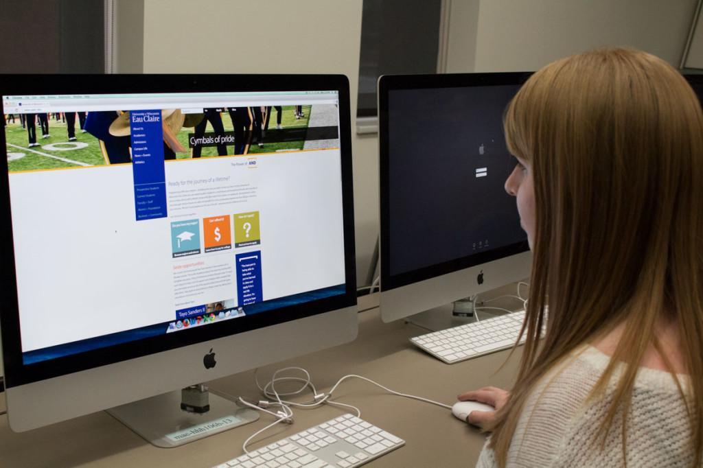
Senior Kayla Menzie says although the new website is attractive for incoming students, it is not user friendly for current students.
January 29, 2015
On the second week of January, UW-Eau Claire students were sent an email regarding a website makeover which would allow prospective students a much easier opportunity to browse and apply.
Despite the aim by Eau Claire’s Integrated Marketing and Communications department to make the website more mobile friendly and to assist prospective students, many have begun to question the change.
Freshman Anna Drawenek said she likes the look of the new website, but with the unique design found some drawbacks with the location of links for D2L and Webmail.
Along with Drawenek, junior Haakon Lean also had similar thoughts on the website and how the look is interesting but confusing to get used to.
“I hope that someone is able to rearrange the quick links to accomodate for current students needs,” Lean said. “However, I like the design and I can see how it translates well to mobile devices as well.”
During the rebuild of the website, students were notified that periodically the site would be down and access would be limited as Learning and Technology Services made changes.
Craig Mey, director of computer services, said LTS partnered with the university’s marketing department in order to meet their standards and to allow them to put content where they wanted.
Mey and the LTS team completely changed the website over to make it more mobile friendly for tablets and mobile phones. But most importantly, make the website more searchable and user friendly for prospective students looking to apply.
“The website change allows us to keep up with trends in today’s mobile markets,” Mey said. “But the biggest thing is that it allows students looking at applying a much easier way to see what the school all offers for them.”
Rebecca Dienger, director of marketing at UW-Eau Claire, said the site is focused on prospective students, and with LTS they created separate audience pages to make sure they were also serving the needs of current students, faculty, staff, alumni and community.
“Having a homepage dedicated to prospective students will help visitors quickly learn about academics, student life and the value of a UW-Eau Claire degree,” Dienger said.
The new website allows visitors to utilize a new updated search bar on the top of the page to search for what they need. The search will then open up a page of results similar to what websites like Google do today, Mey said.
Among the most important of the new features for the university though is the available analytics. These analytics allow LTS to see what sections of the website are being used and visited most often so they can make changes as they go if needed.
Dienger said that prospective students and current students using the website as a search tool to browse more easily is something that the admissions department wanted for awhile.
“The structure of the site helps position the university better for reaching those conducting their college search online,” Dienger said. “It allows us to feed stories that give visitors a fast read on what distinguishes UW-Eau Claire regardless of where they enter the site.”
Sophomore Kelsey Olson said not only does the website look well organized, it also does a good job of showing how great the campus looks and what it really offers for current and future students.
Although the new interface has been finished for weeks now, Mey said this is not the end of the road for changes and updates. They have allowed students and faculty to let them know what they think through a pop up comment box.
As for what is next, Mey said that Marketing and LTS will continue to work on the website by adding new content for separate departments and schools within the university.
“Many small things will continue to change down the road,” Mey said. “We will continue to add content to each department and make small changes to layout as need be.”

